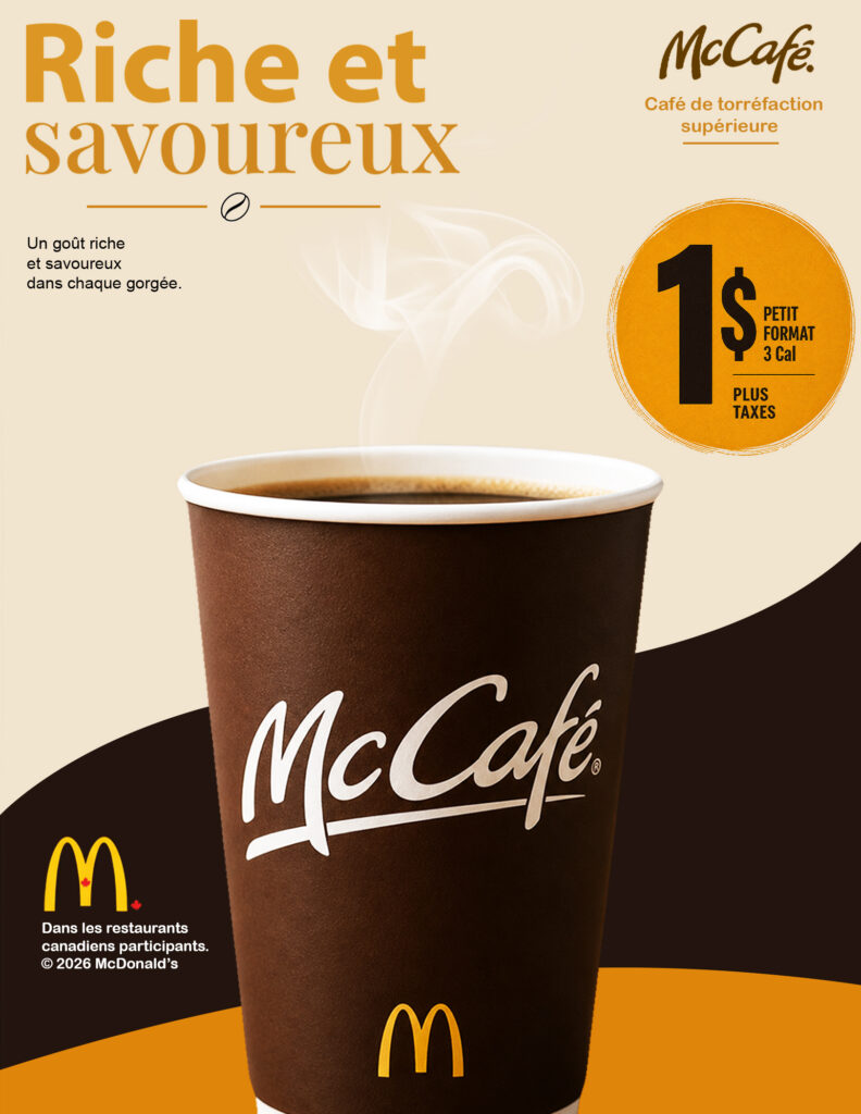
For this Project, I created a magazine advertisement for McCafe to promote its coffee and communicate the idea of rich flavour at an affordable price. I used the headline “Riche et savourex” to emphasize the taste and appeal of the product. The large coffee cup acts as the main focal point, while the $1 promotional circle attracts attention to the price. I chose a colour palette of gold, black, brown, and cream to create contrast and communicate warmth, richness, and quality. I also used different typography styles to establish a clear visual hierarchy, combining bold lettering with elegant serif typography and the McCafe script logo. The curved black shapes add movement and help frame the product. Overall, the goal was to create an attractive, easy-to-understand advertisement that combines product appeal, brand recognition, and promotional messaging.